-
Interior Design: Choosing A Wall Color


The right paint color can either help everything come together harmoniously, or mess up the whole atmosphere. Painting first however, is a common mistake. Logically, most people want to paint, long before bringing in new decor. Paint comes in a plethora of tones, and colors. Where on the other hand, textiles, art, and decor are slightly more limited.
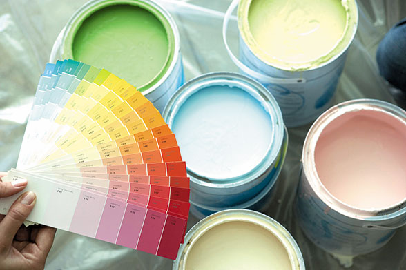
Once the furniture and decor has been chosen, and is in the design space, then it’s time to bring in the fans and swatches of color. It is best to look at them during different times of the day, and in different lighting. For example; making sure the brown that has been chosen, isn’t actually giving off a hint of green in the evening, or a yellow tint in the morning.
Color psychology should also play a huge roll in color making decisions. Consider what atmosphere is trying to be achieved? A peaceful calming environment? Then cool tones are best, such as greens and blues. Cool tones are more relaxing and are often used in beach house designs, bedrooms, and bathrooms. Warm tones are usually used in the living areas, because they have a energizing affect, and can even play a roll in an individuals appetite.
Color psychology also pulls from an individuals emotional memory. If there are good memories cooking in the kitchen with the family growing up, use the same color scheme. Lets say the childhood kitchen was peach and teal. Try turquoise and a trendy coral. Still pulling from those happy memories, but leaving the 70s in the past. If there are no past designs to pull ideas from, use reds and yellow tones. Red and yellow are directly linked to stimulating the appetite. If cutting calories is the goal, try muted variations such as; browns, deeper reds, tans, golds might be better for .
Once the right paint color has been chosen, the design is complete. The correct color will pull design, textiles, lighting, textures, and colors together perfectly. Achieving the perfect atmosphere and ambiance.
-
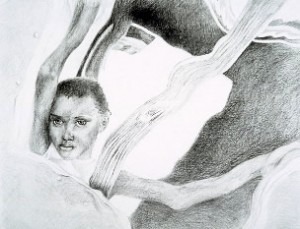
Surrealism: Living Light
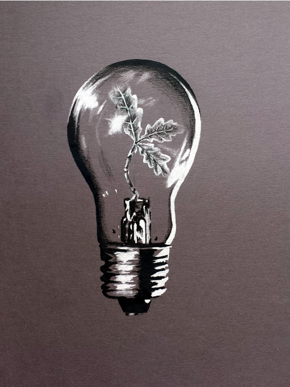 – Krystal Marie
 -
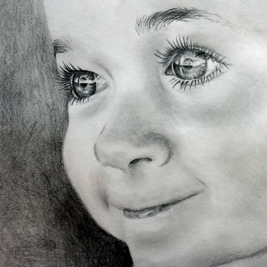
Photorealism: Eyes
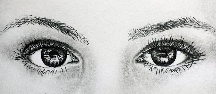 -Krystal Marie
 -
TBT: 99′ Dr. Marten
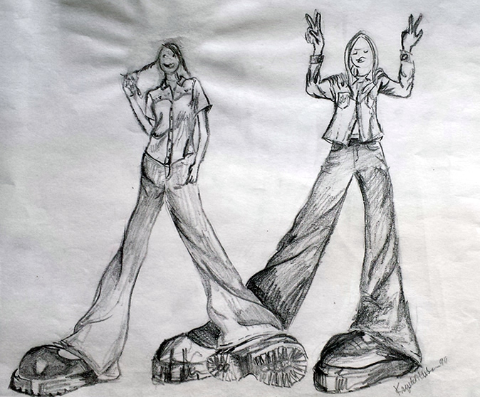 -Krystal Marie
 -
Impressionism: Cake It On Smear It Around
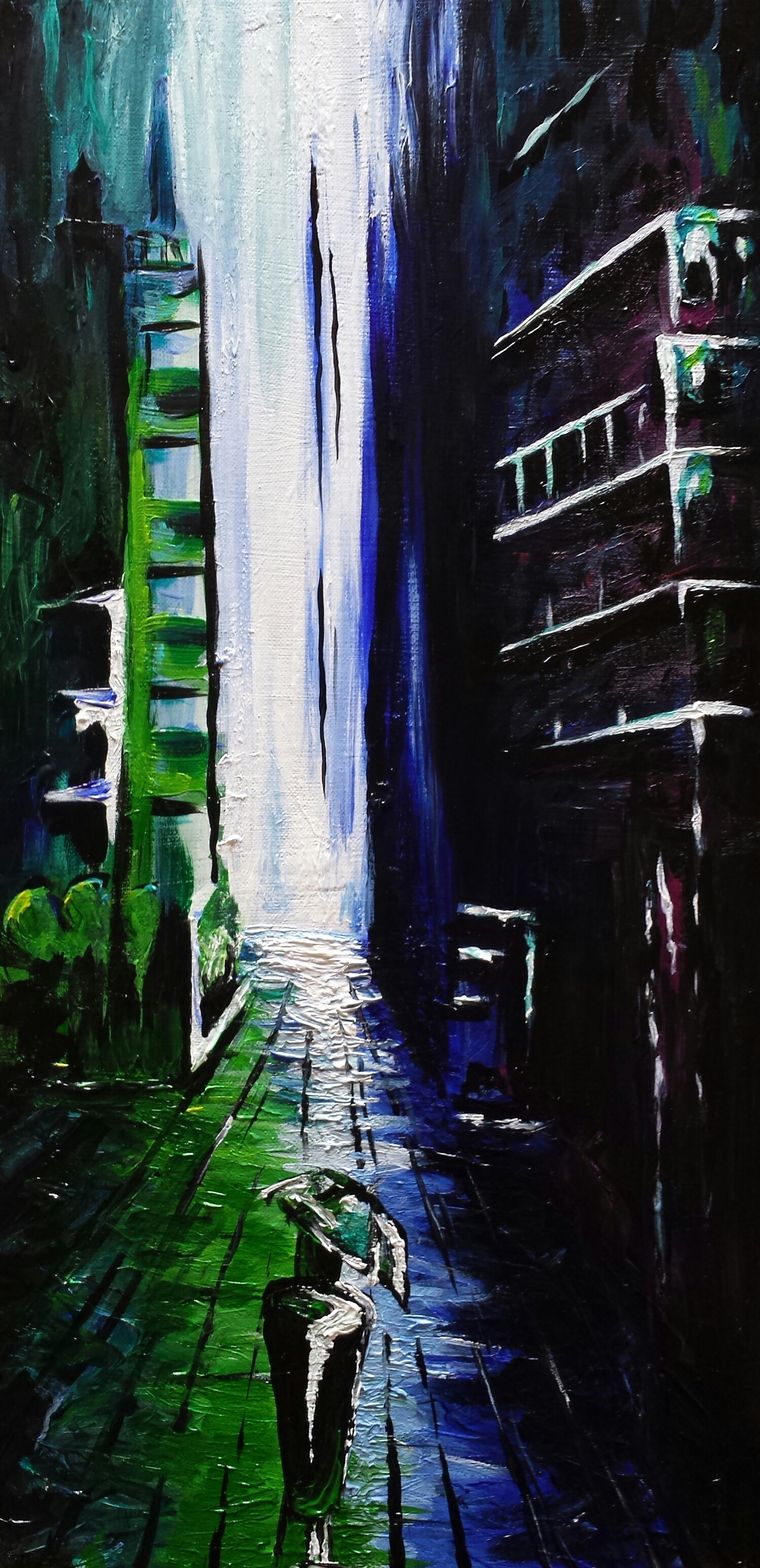 -Krystal Marie
-
Site Skins: Vintage Clothing
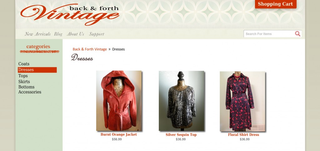
– Krystal Marie
-
Dirty Room
-
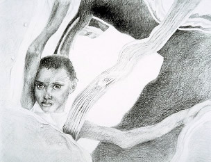
Enslaved
-
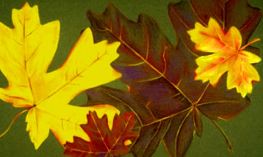
Autumn
 – Krystal Marie
 -
Practice, Practice, Practice